We defined Good Side's project timeline over a 6-month period from ideation all the way to the brand launch.
Shopify & Klaviyo Development
Good Side is a new business based in New York City.
Problem Statement
Good Side reached out to us as they were developing a brand new brand of homeware essentials. They were seduced by our ability to create beautiful yet simple designs to launch their brand to Australia and the USA.
Solution
We worked hand-in-hand with Good Side in order to take them through all the steps a start-up needs to take in order to launch successfully.
Strategy and timeline definition
Go-to-market strategy
Regular project check-ins
Extensive video calls to align
Shopify develepment
Design consulting and execution
Full Klaviyo setup
Payment Services Integrations
Testing & Launch
Services Provided
We helped Good Side define a proper go-to-market strategy in various areas: from advertising to website features, emailing, and social media tracking.
Over the months we built a proper marketing plan for a successful launch.
As Good Side is based out of New York City, we met multiple times a week through Zoom to ensure everyone was up-to-date on the latest developments and actions.
We designed and developed a Shopify website from scratch for Good Side. The result is a beautiful e-commerce website that converts well.
As part of the Klaviyo build, we designed pages including product pages, collection pages, and home page to bring the Good Side brand alive. Keeping in mind User Experience, SEO and device limitations (phones, tablets, desktops).
To support Good Side's launch, we implemented automated flows, email templates and sign-up forms in Klaviyo. We ensured the data between Shopify and Klaviyo was flowing correctly to allow Good Side to build high-conversion email marketing campaigns.
To improve conversion rates and offer customers the best possible experience, we integrated various Payment services solutions, including Afterpay and Klarna.
We tested everything on the Shopify website we created, including user experience, payment, and tracking.
We then launched the website followed by an array of Social Media, PR and emailing campaigns.

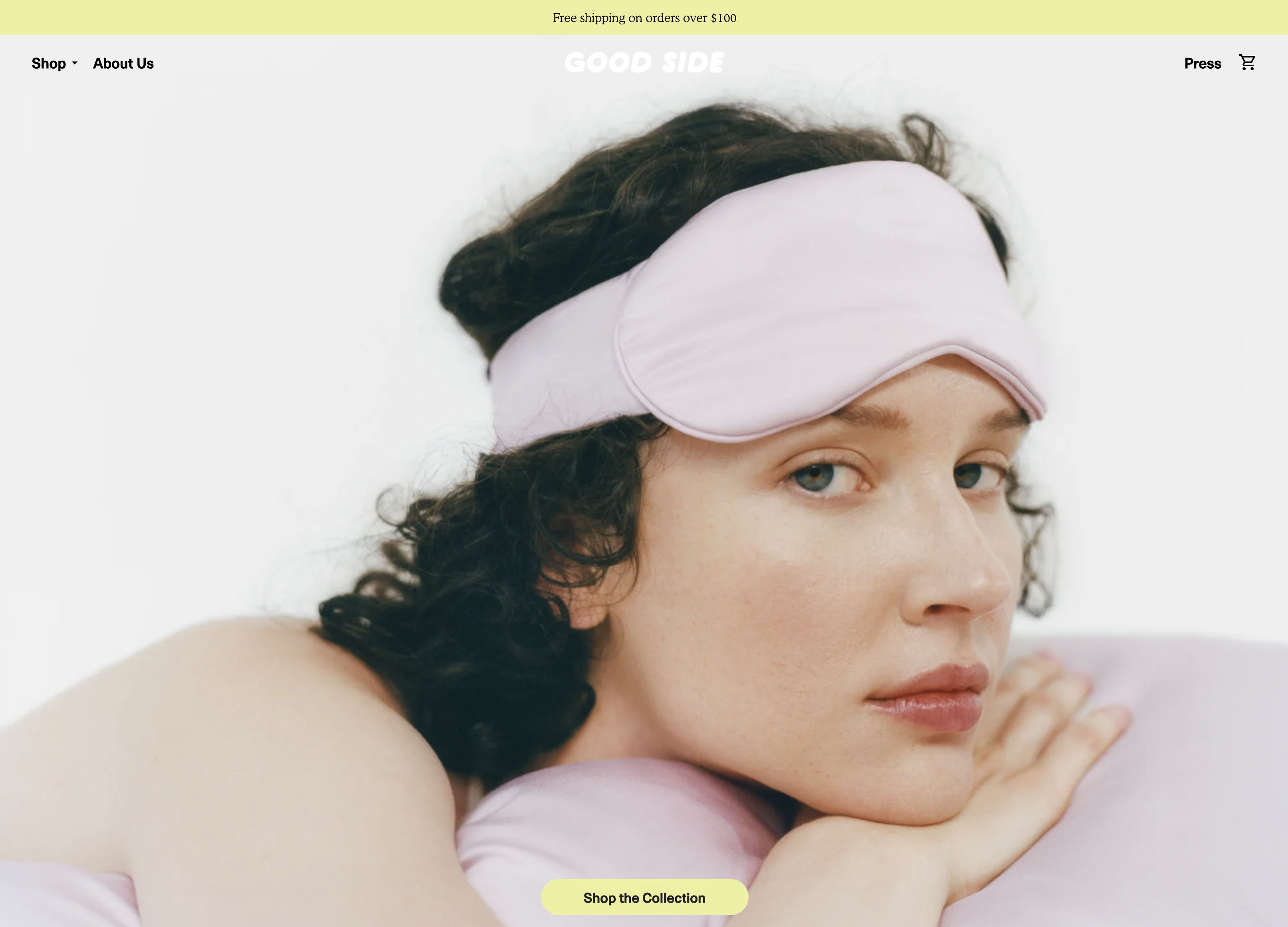
A clean
design
With a simple navigation and a clear call-to-action
for great readability and user-experience.

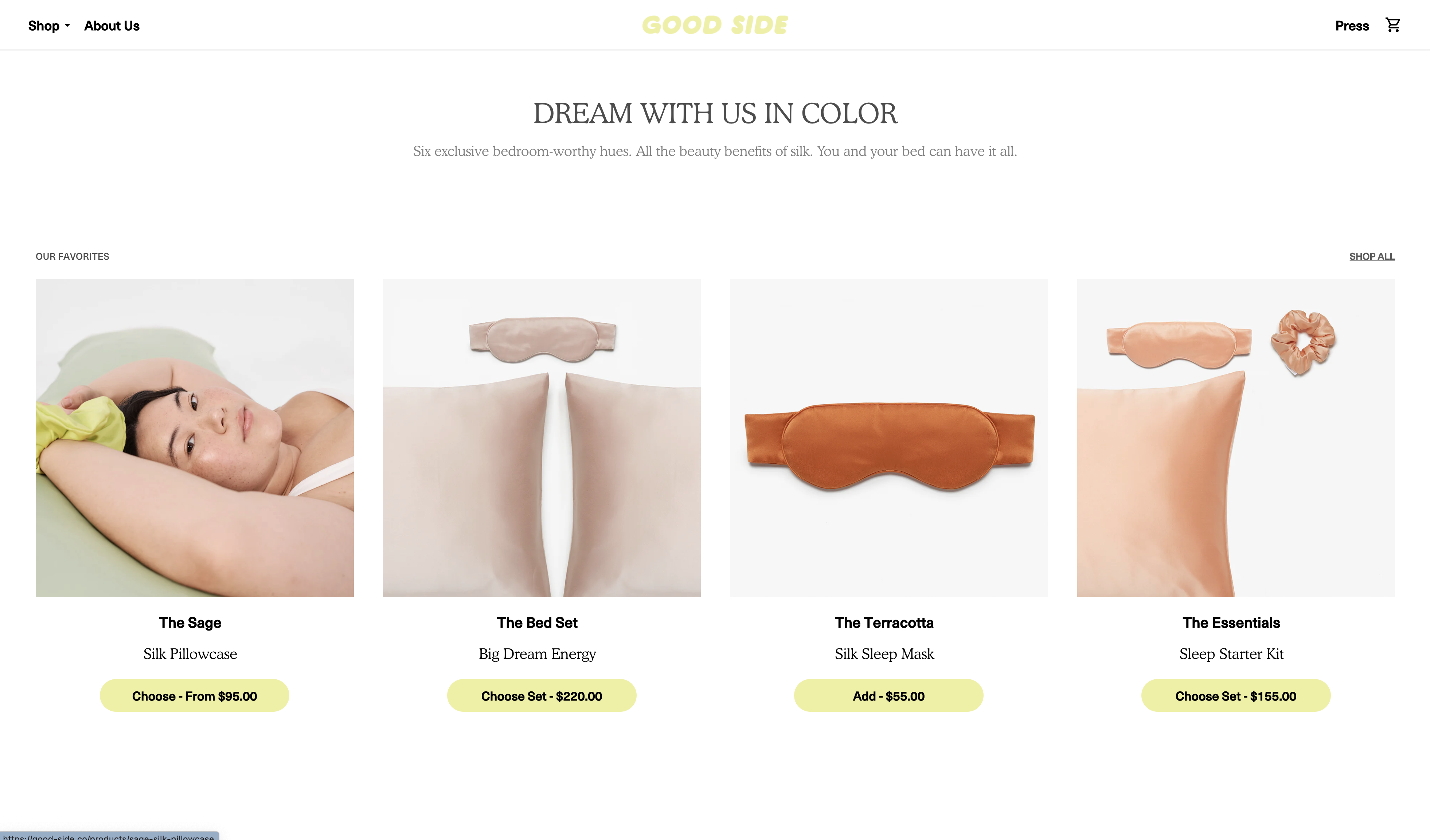
Up-sell & Cross-sell
Integrating up-sell and cross-sell options on the homepage
from various product categories

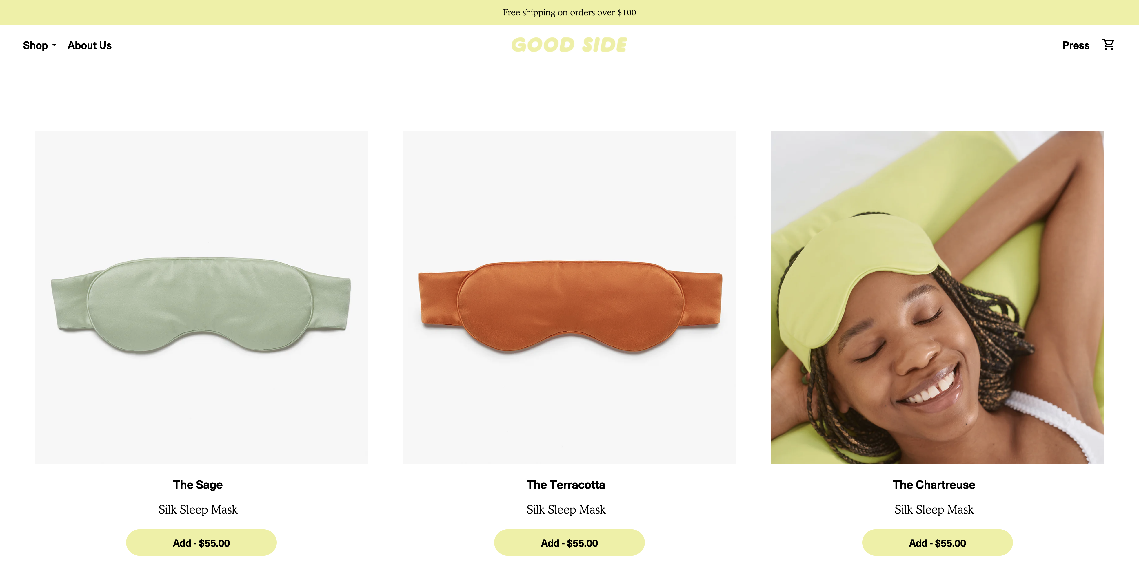
Custom, animated
collection pages
While keeping the design clean,
we have added interactive elements to the collection pages
to bring the website to life and show the products in a different angle.

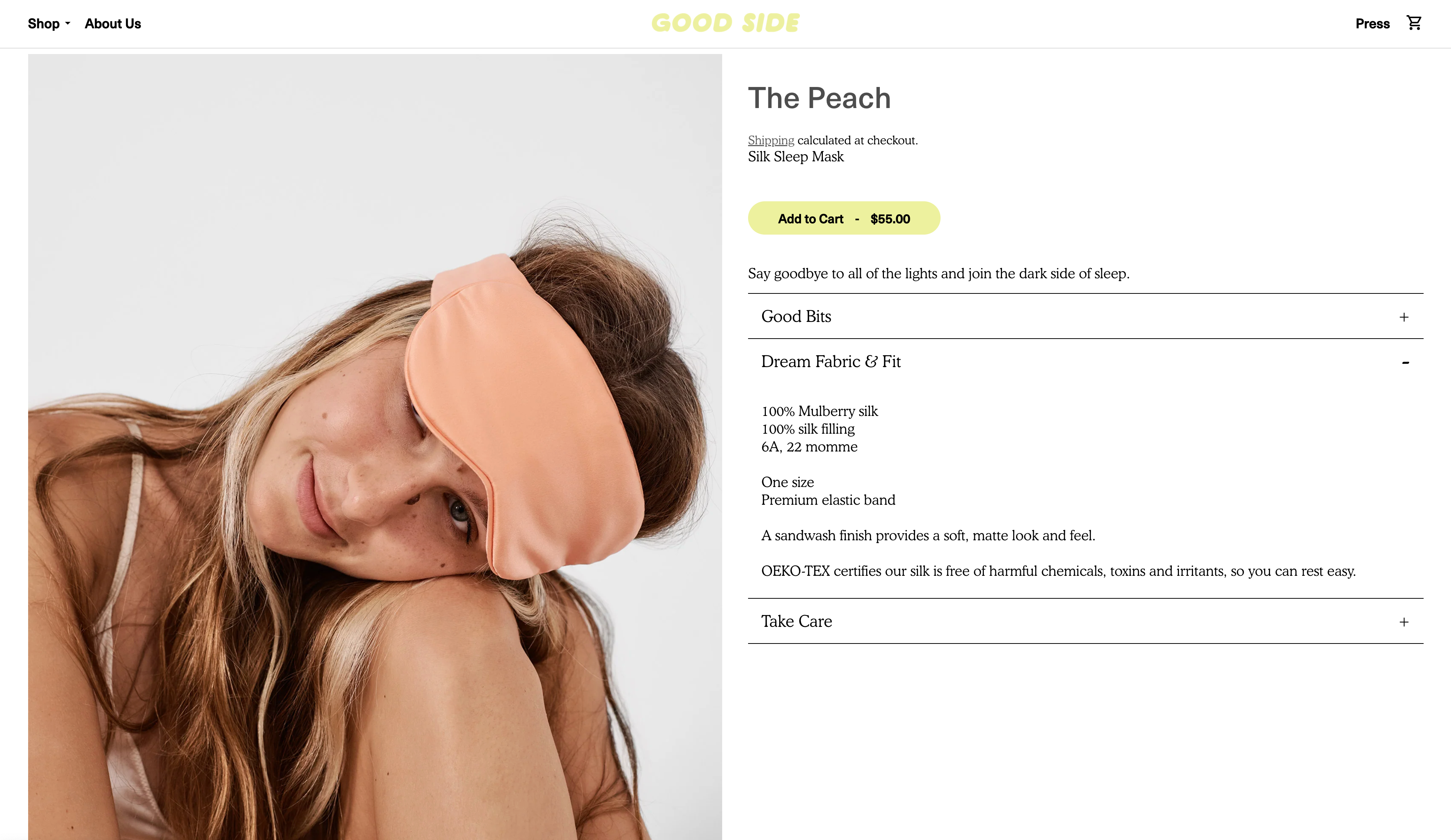
A completely custom
product page
An accordion menuto organise the content efficiently.
A scrollable gallery of images on the left for more interactivity.

